Adventures in Logo Design
I’ve always been interested in logos and how they effectively represent a brand. As a designer, creating a strong brand is very important. It helps customers get an idea of what type of service you provide quickly.
I recently updated my portfolio website and decided an important addition would be to create a logo. I wanted to create a strong visual for people who were looking over my website and I was hopeful that this would help me create more of a ‘brand’.
I started to do some research and decided that the main component of my logo should be typographically based. This would help demonstrate my understanding of detailed typography.
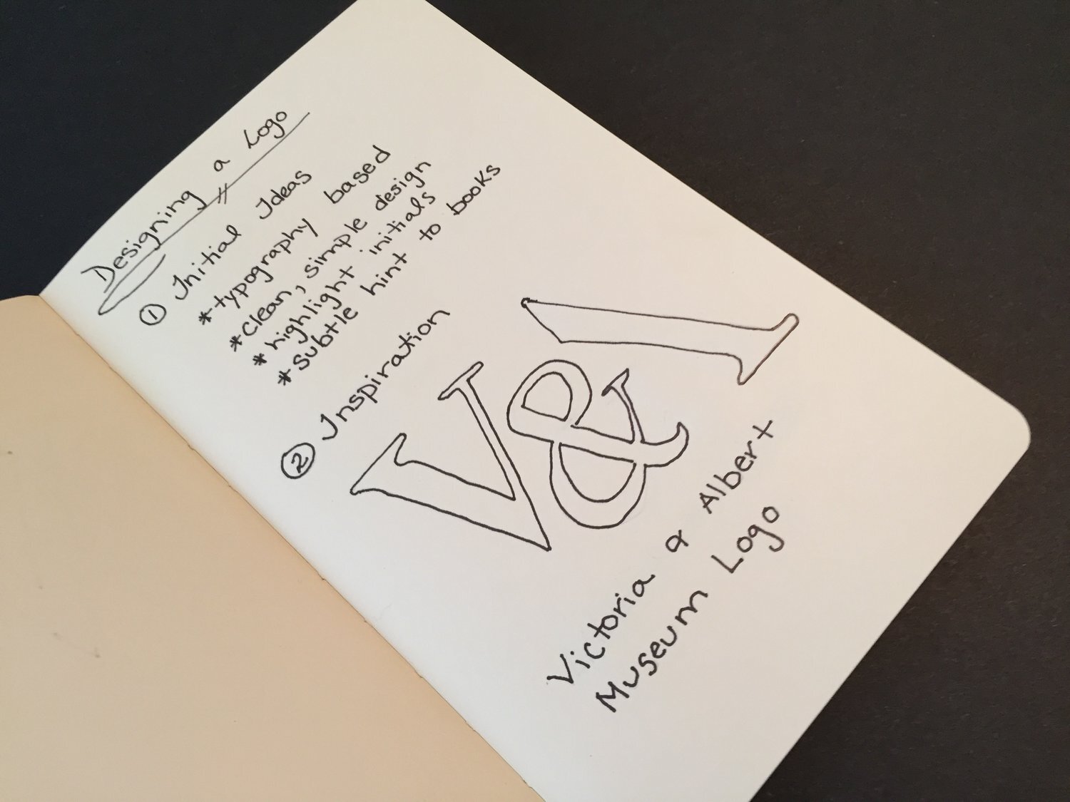
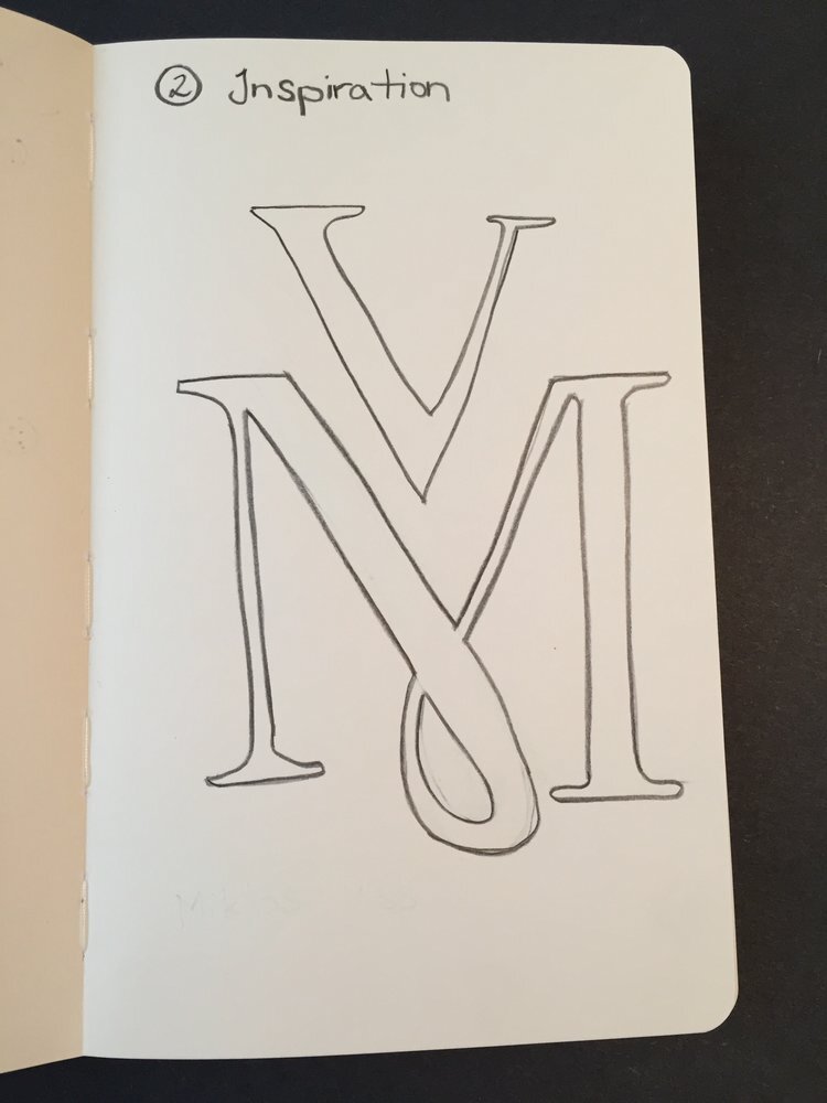
I was inspired by the Victoria and Albert Museum’s logo, designed by Alan Fletcher. It’s simplicity effectively creates a strong visual for the V & A Museum. Fletcher created some intrigue, without compromising readability, and a unique design by playing with the placement of the ‘&’ and removing a portion of the ‘A’.
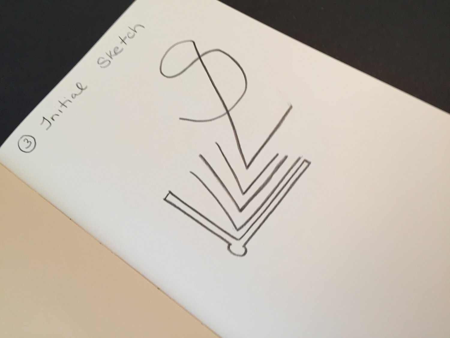
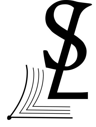
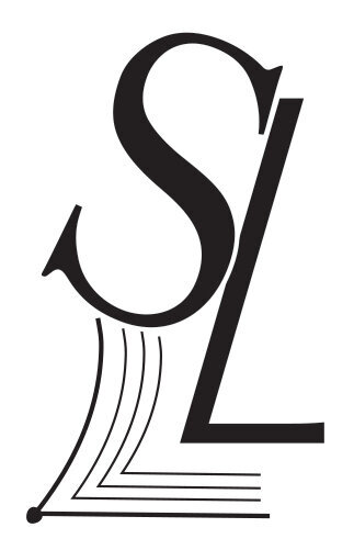
The challenge was to include my initials (‘S’ and ‘L’), my understanding of detailed typography, and my focus on book design. After some initial designs, I realized that the by playing with the angle of the ‘L’ I could create a small graphic detail (an open book) that would allude to my focus on book design.
Here are some of my initial sketches and some images of logos that helped inspire my final design:
